🏢 Client
🔗 Website
🏭 Industry
📅 Timeline
🖥️ Platform
🧍♂️ My Role
🛠️ Tools
✨ Activities
Eigen
Oil & Gas
May 2022 → July 2023
Desktop
UX Designer
Figma, Miro, Confluence
Product Discovery, Usability Evaluation, Sketches, Wireframes, Prototyping

In a relentless pursuit of efficient extraction, this advanced drilling visualisation software revolutionises oilfield infrastructure by empowering data-driven decisions for optimised drilling path planning and maximised reservoir yield.
Introduction
Eigen is interactive visualisation web application which helps oil and gas operators build and deploy digital oilfield technology. The platform provides its customers with charts, graphs, and alerts that enable oil and gas them to unlock insights and make better decisions through data and interactive visualisation. It is used by oil and gas operators of all sizes, from small businesses to large enterprises.
Eigen is not just a web application; it’s a revolution in data visualisation for oil and gas. Imagine a platform that transforms complex data into clear, interactive charts, graphs, and real-time alerts, bringing your oilfield to life right on the employee’s screen, advanced analytics predict equipment failures before they happen, allowing you to schedule maintenance proactively and minimise costly downtime.
Problem Statement
Eigen’s existing platform was a technical application built and deployed with Atlassian Confluence, with different modules that were accessible as a plugin. Moreover, features were being added and extended and as a result the product was not always intuitive for a user how things work. This growth has put a strain on the platform’s UX, and users have reported a number of usability issues and the platform did not showcase the company’s unique technology in a compelling way.
As a result, Eigen was not able to attract and retain potential customers as effectively as it could have. The key problems that were identified during stakeholder interviews included:
- The platform was not user-friendly
- The platform was not accessible to users with disabilities
- The platform was not responsive (charts and graphs were not correctly displayed)
The Design Process
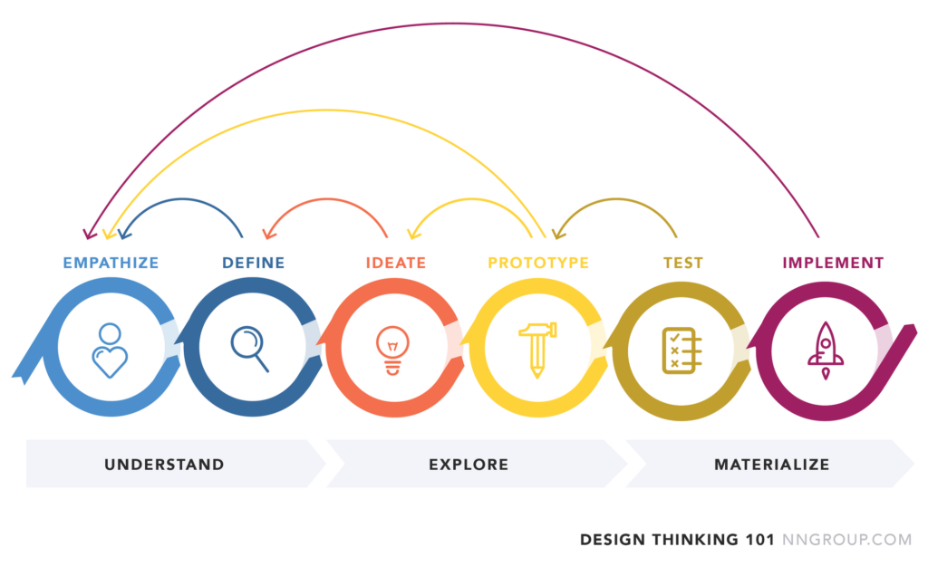
The UX redesign process was conducted using the design thinking process. This hands-on, user-centric approach is defined by the design thinking process and comprises 6 distinct phases, as defined and illustrated below.
The empathise phase involved conducting user research to understand the needs of the stakeholders. The define phase involved generating ideas for how to improve the UX of the platform. The ideate phase involved creating wireframes and mockups of the new design. The prototype phase involved building the new design. The test and implement phases involved testing the new design with users and making changes based on their feedback.
Empathise
To better understand the problem, I initially conducted interviews with the company’s stakeholders, in order to identify pain points and opportunities for improvement. Next, I conducted an in-depth usability review to understand the platform’s limitations. I also conducted a competitive analysis to understand how other companies in the same space were communicating their value proposition through their website design.
Throughout my usability review, I discovered it was hard navigating the website and using Confluence as an interactive visualisation web application. Additionally, users were not able to easily understand the value proposition of Eigen’s products and services. These findings were consistent across stakeholders interviews and usability reviews, indicating that they were significant pain points that needed to be addressed.
Define
The ideation phase involved generating ideas for how to solve the problems that were identified. The ideas were generated through brainstorming sessions and user interviews.
Some of the ideas that were generated included:
- Creating a more intuitive user interface
- Adding accessibility features to the platform
- Ensuring the new application is fully responsive
Ideate and prototype
To effectively communicate Eigen’s value proposition, we used a modern and visually appealing design that showcased the company’s high-tech and innovative approach to solving complex data problems.
Based on my research findings, we decided we will have to develop a new design that addressed the pain points identified in our research. We created a whole new web application that was intuitive and easy to use, and we also reorganised the content to highlight Eigen’s unique technology and value proposition.


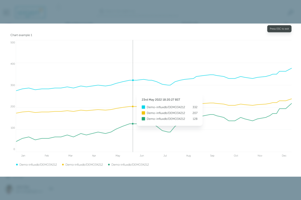

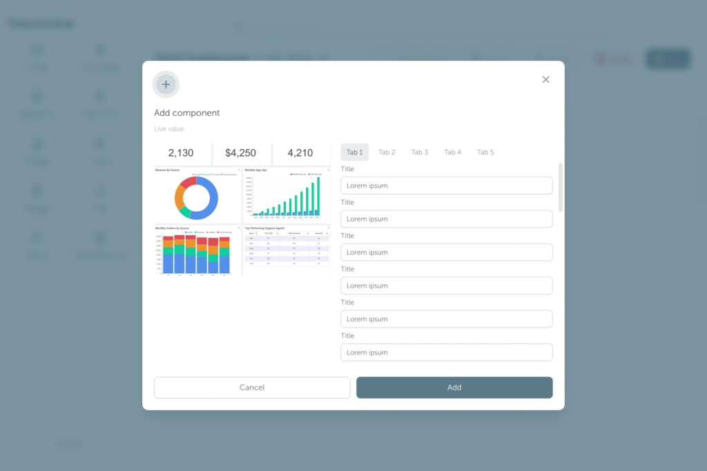
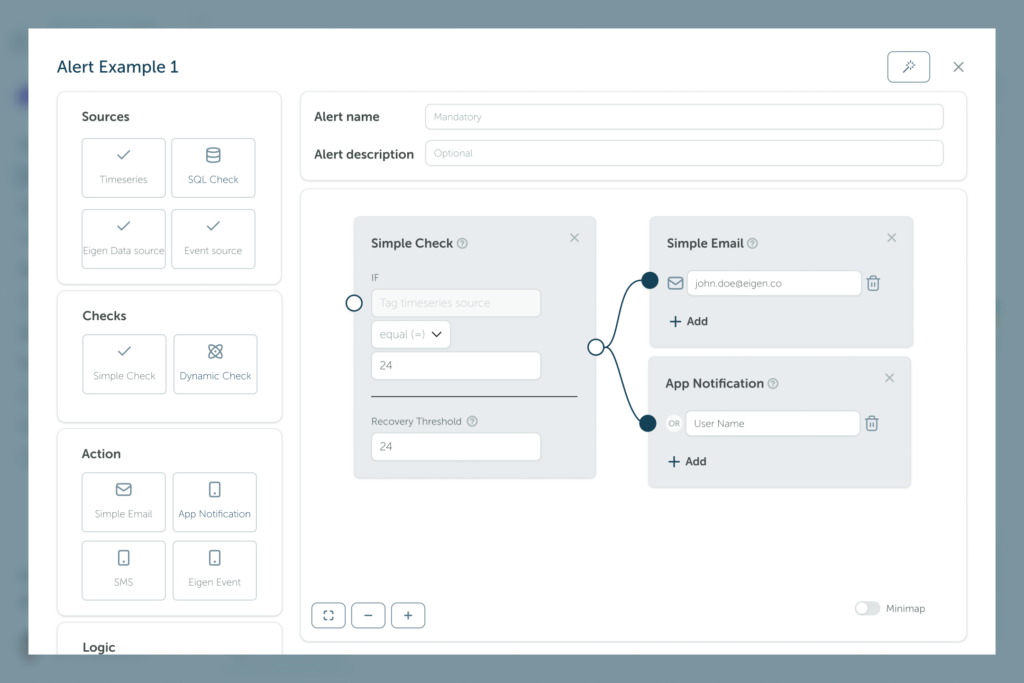
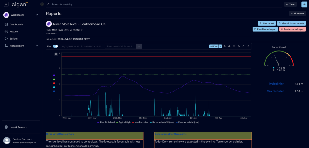
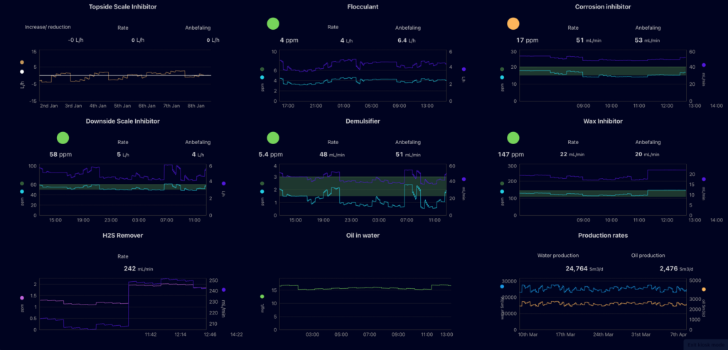
💡 As the company didn’t have a design system, during the design phase we decided on using Untitled UI, the largest UI kit and design system for Figma. This saved the company time and money, as it came as an out-of-the-box design system and we didn’t have to create new design components. Not only this, but all the components were accessible from the start and this let us tackle another issue we previously had.
Test
We conducted several usability tests on the new design to ensure that it was effective and user-friendly. We also gathered feedback from users to identify any areas for improvement. Based on this feedback, we made iterative changes to the design to further improve the user experience.
Results
The new website design was successful in addressing the pain points identified in my research. Users were able to easily find the information they were looking for, and the new design effectively communicated Eigen’s value proposition.
The modern and visually appealing design helped the company stand out in a highly competitive market.
Conclusion
Through our user-centred design process, we were able to create a new web application design that effectively communicated Eigen’s value proposition and addressed user pain points. The new design resulted in current clients being happier with the new web application, and helped Eigen establish itself as a leader in its field. Our approach to user research, design, and testing helped us create a web application that not only looks great but also effectively communicates the company’s unique value proposition to potential customers.
Design Handover
Prioritising iterative design and development sprints allowed me to effectively handoff each feature in stages, facilitating ongoing dialogue and rapid problem-solving throughout the project.. Leveraging my developer background, I translated high-fidelity mockups into detailed specs during weekly sessions with devs, ensuring seamless iteration from design to development. Through meticulous documentation, and clear accessibility guidelines, we equipped developers with the necessary resources to faithfully translate the design vision into a functional product..
❗Halfway through the project, during the design phase, due to personal commitments I handed over the project to another UX designer, being handed back the project six months later, then handing it again to another designer as I left the project for a full-time job.
Reflections
💭 Unfortunately, I was not being able to do any user interviews, due to restrictions imposed by the stakeholders. This would have been the first thing I would have done in the research phase. This made me recognise the value of conducting thorough research to uncover user insights and validate assumptions.
💭 What I learned most from this project was the importance of understanding the business needs and goals, how to hand over a project to another UX designer (and then pick up the project again), and the importance of effective communication, teamwork, and collaboration with cross-functional stakeholders throughout the design process.
💭 The project serves as a reminder of the ever-evolving nature of UX design. It motivates me to stay updated with industry trends, emerging technologies, and best practices. It encourages me to embrace a growth mindset and a commitment to continuous learning.
“Madalin did a fantastic job of auditing our UX and identifying significant improvements. It was not an easy task as we have a very technical product in a niche area but Madalin asked the right questions and gave us a way forward to improve the experience for our customers”
– Murray Callander, CEO